Design is my second love (after writing). I worked as a designer for Creative Services for about a year at Berry College (before moving across the hallway to Public Relations), and I’ve kept up on my graphic design enthusiasm since. So when I needed to design a business card, I dove in head-first!
However, I know that my nerd-love for design isn’t something every writer shares. When it comes time for conferences, gatherings, or other writing-related events, it’s always a good idea to have a business card on you. This entry will help give you direction as you start to poke around for ideas.
First, we’ll examine a few design concepts and examples from my realm of contacts. Then I’ll share some of my favorite big-name authors and design companies! At the end of the post, I’ll also share five universal tips for author business cards.
Basic Inspiration: What to Include in Your Business Card Design
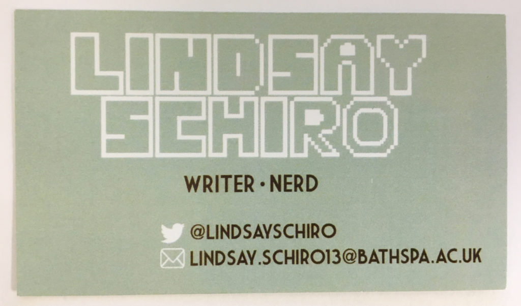
Personality: The Lindsay Schiro
This design is fun and quirky, a great representation of the writer behind it. Lindsay’s middle grade manuscript is about a gaming guild who go on a cross-country roadtrip to GameCon. The fonts she’s selected and the casual tone of the card (“nerd”) show her personality and hint at the stories she likes to write.
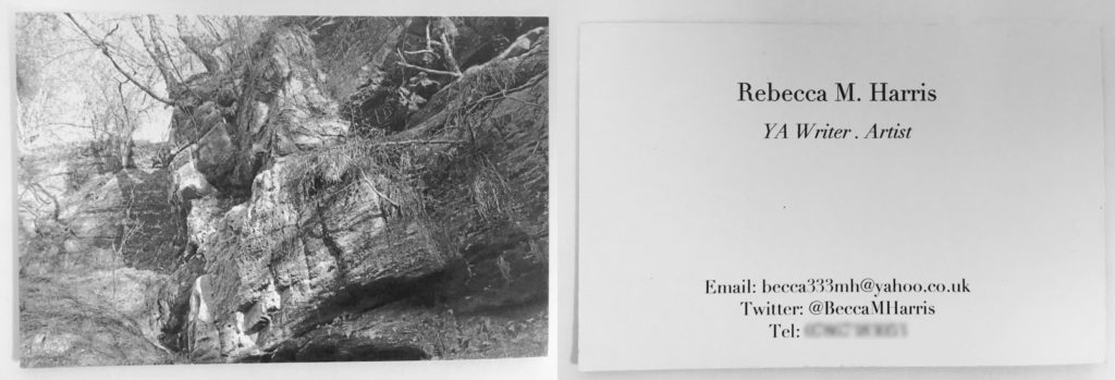
Setting: The Rebecca Harris
I liked this idea by Rebecca Harris. Her first chapter takes place in a real location, so she used a photograph from the spot on her business card. Her writing is also incredibly place-centric, so this is fitting to her work.

Aesthetic: The Annie Freeman
Annie’s manuscript is about a shapeshifter, so back in the initial stages of drafting I made her this minimalist fanart. She decided to use it for her business card, and it looks brilliant! The colors are eye-catching, and it does a nice job of capturing the essence of the story.
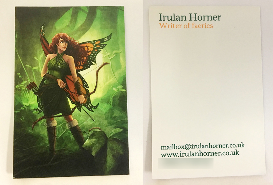
Concept Art: The Irulan Horner
Irulan hired my sister, Laura, to paint the main character of Feral Faerie. The art on her business card shows the story’s flavor while also providing a vivid illustration of the main character.

Stylized Writing Samples: Me
When I sat down to design my card, I knew I wanted to incorporate text. I love Moo’s “You Missed a Bit” template, and wanted to bounce off from that. I started playing with chunks of text and abstract, collage-like effects. Eventually, I hired Laura to create vintage-looking profiles for my two main characters in Illuminate. I laid my text collage on top of it, and came up with these variations. (With Moo, you can order multiple designs in the same pack, so I had a couple of copies for each card back.)
Because the front was a neutral color, I opted for a saturated purple behind my text. I’m quite pleased with it! And I’ve gotten some kind compliments from agents and others who I’ve shared the card with.
Advanced Inspiration: What the Pro Authors are Doing on Their Business Cards
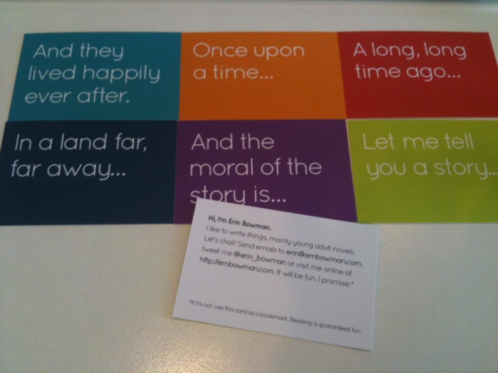
Clean and Simple: The Erin Bowman
These cards are both fun and professional, with great bold colors and effective text. They would also be easy to use for your own inspirational purposes.
Depending on your confidence in your own writing, you could swap out these standard phrases for a line from your book. My fellow-alumnus Lucy van Smit used the graphic art I did for her hook line on the back of her card, and it looked nice!
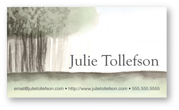
Art: The Julie Tollefson
Similar to Irulan’s artwork above, commissioning an artist to create an image unique to your book (or author brand) can be a great way to go.
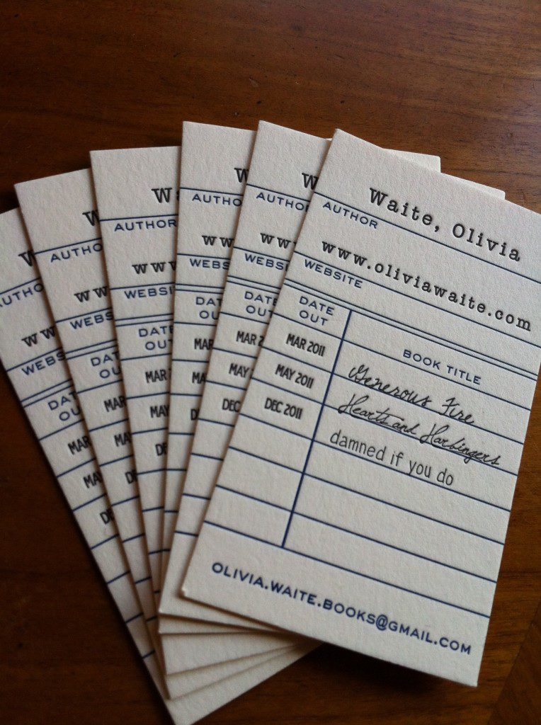
Library-Themed: The Olivia Waite
Aren’t these gorgeous? And so nice for an author (especially one that has multiple titles!). Letterpress tends to be expensive, but can make up for the cost by how addictively tactile the final product is.
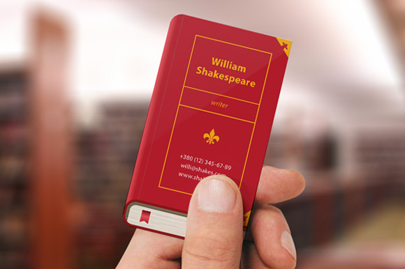
Book-themed: From Creative Market
Adorable! You could swap out the title for whatever your book will be called (or just play it safe and use a classic literary title).
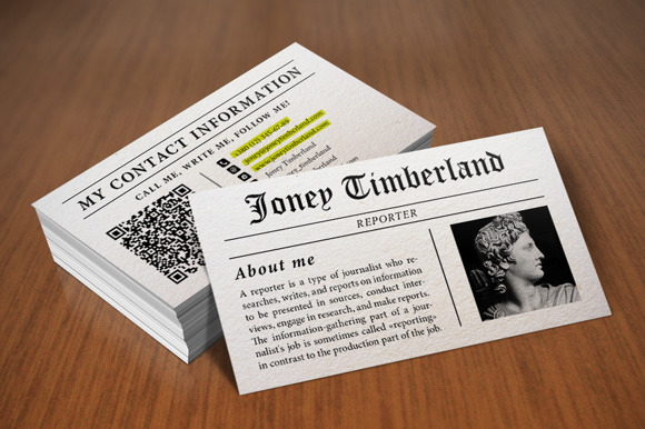
Newspaper: Also from Creative Market
While newspapers might come across as a bit dated (sorry, print!), this could be a great option depending on your genre. I love how you can get a little blurb in there (possibly with a headshot?) and use the modern scan code on the back.
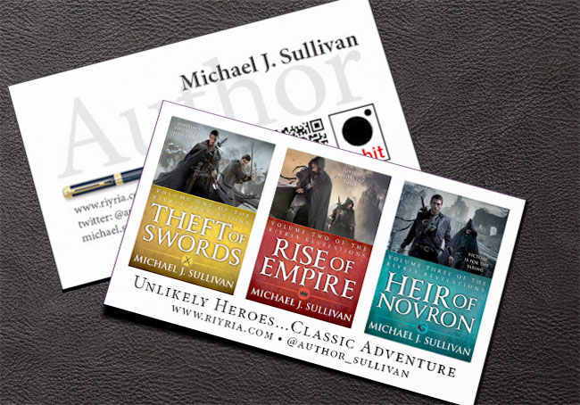
Cover: The Michael J. Sullivan
Straight forward, but why mess with the obvious? Show off your cover on your business card.
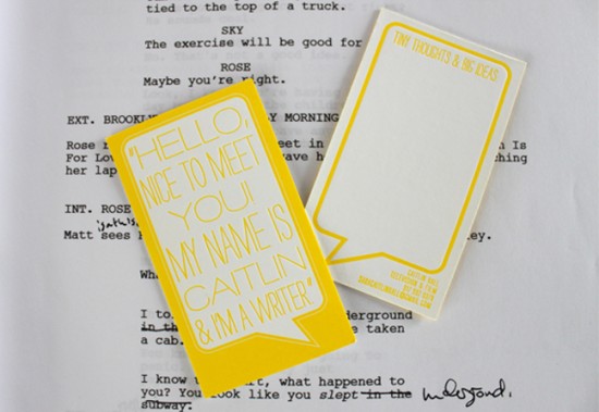
Quirky: The Caitlin
These are simple but sweet. The room on the back could be great for writing a note to the person receiving the card, or you could fill in that blank space with more information.
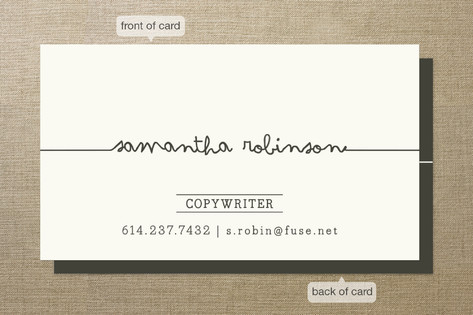
Minimal: The Minted
Simple and straightforward, but with enough charm to be sweet. This is a nice option if you don’t want to obsess about design!
It should be obvious, but I’ll just say it anyway: Be careful not to plagiarize these designs! Take the ideas behind them and run, but turn them into something original.
5 Universal Tips for Author Business Card Designs
- Do use good quality paper. Vistaprint might be tempting because it’s so dang cheap, but you can identify a Vistaprint card by the flimsy touch and the smudging ink. When I hand someone a card from Moo, they’ll often stop and take a moment to run their fingers over again. It feels nice!
- Do make sure the images and text you’re using are print-quality. Pixelated material looks amateur. Here is a fairly basic guide for resolution and printing.
- Do show the design to some (hopefully qualified) test audiences. I always run my design ideas past my sister (a freelance illustrator) and my writing partners.
- Do make sure you have the copyright for the images you’re using. This means they either need to be: 1) Your original design, 2) Off a template from the printer you are using, 3) From a stock website, or 4) Used with the permission of the photographer/artist.
- Do crop your template according to the print size. My designer heart withers every time an author hands me a card where they have clearly squished a picture into the margins. Please don’t do that.
And, finally, if in doubt: Hire a designer to do it for you!
Places to look for more inspiration:
– Modern and Unique Business Cards
– I can’t vouch for the quality of Zazzle’s printing, but they have some some cute designs (there are also awful designs, so choose with caution)
– Moo’s writer collection
– 21 Creative Business Cards Ideas and How to Get the Look on Canva

