Story graphics are one of my favorite parts of productive procrastinating, and one of my favorite types of story graphics is creating character concepts. I got this idea from my sister, Laura Hollingsworth, who uses it sometimes to brainstorm ideas for her webcomic, The Silver Eye.
Though I’ll be using Photoshop for this tutorial, you can really use any photo editing program that lets you adjust layers and occupancy. (GIMP is a good, free alternative to Photoshop!)
Step 1: Find a Base Image
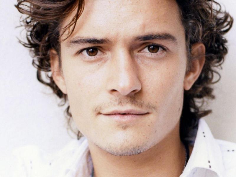
Find an image that basically looks like your character. This image will be at the base of your collage, so it’s probably one of the most prominent in the collection.
Golden rule: All images must be face-forward, as near a direct angle as possible. We’ll look at why below.
For my collage, I used the picture of Orlando Bloom above.
Step 2: Set Up Your Image
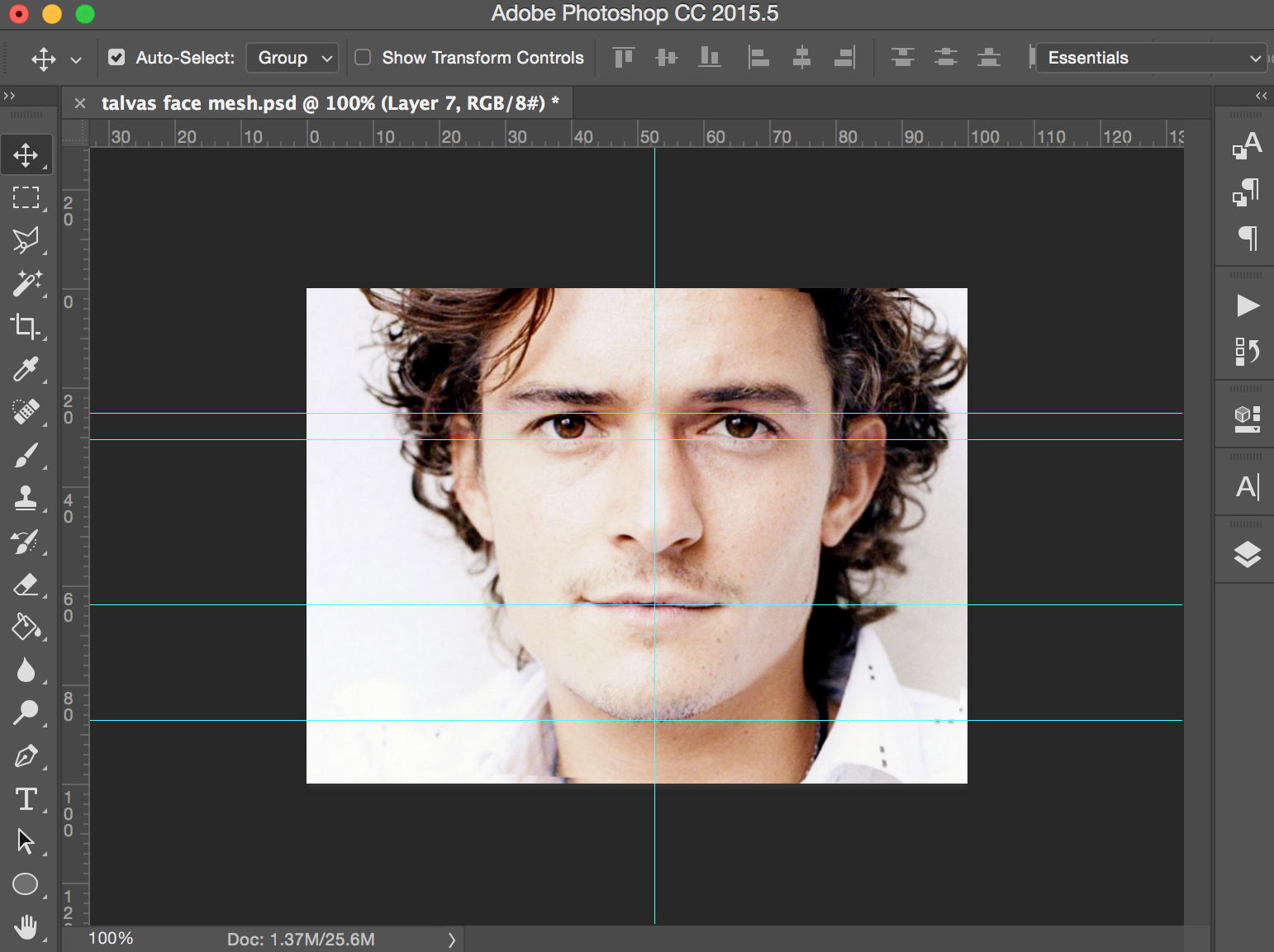
You’ll want to set up guidelines for your image so that it’s easy to layer the faces on top of each other.
Put a gridline:
- On the top of the eye
- On the bottom of the eye
- Across the mouth line
- At the tip of the chin
- Straight down the middle of the face
If you look at my picture here and the one above, you’ll see that I’ve actually rotated Orlando’s face so it’s less at an angle and more straight.
Straight is important because, as much as possible, we want these main elements of the face to line up. If the face is too much at one angle or another, it will create a blurrier image and be less helpful overall.
Step 3: Gather Pictures
Take thee to the internet and get collecting. You want to try to find people with the same basic face structure. Confession: My sister is way better at this than me. But if you look at these guys here, you’ll see that for the most part they have similar chins and the same basic aesthetic.
Once you’ve gathered somewhere between 9-15 possible pictures, you’re ready to start meshing!
Step 4: Place Pictures
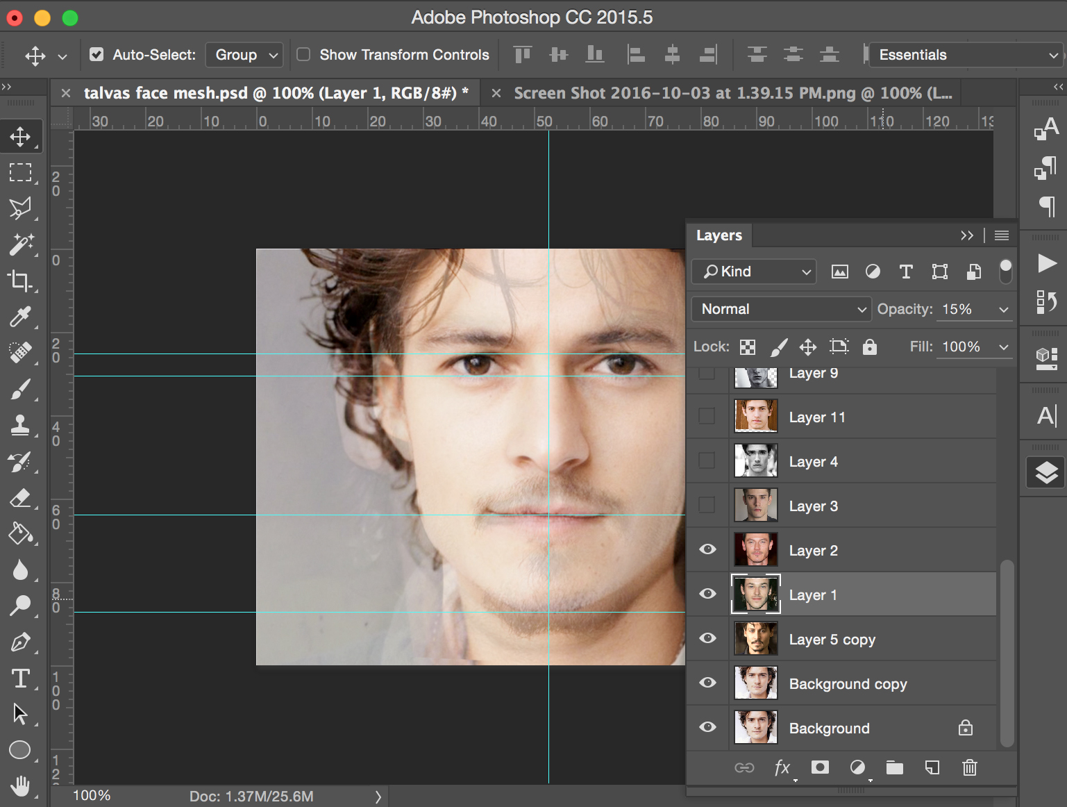
Begin placing the pictures one by one. Make sure the eyes, mouth, and chin align (whenever possible). When it’s not possible, the most important thing to match is the eyes.
Adjust the occupancy for your layers between 5%-30%, depending on how much you want your character to be influenced by a certain image.
Step 5: Meet Your Character!
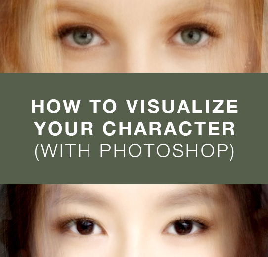
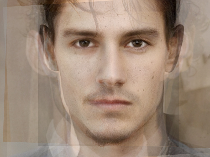
When you fiddle around enough, you’ll be left with something like this: a concept of your character (albeit a bit blurry). You can add on sharpening masks, curves, contrast, and color to make the image look better, if you want.
I’ve always found this a wonderful exercise for really thinking about what my main characters look like. The guy I’ve used in this example is Talvas from Popinjay, and I didn’t even know that freckles were 100% necessary until I started pulling this picture together!
Here are some more of my pictures to act as inspiration for you:


How did the tutorial work for you? I’d love to see some of your characters in the comments below!

