 I was recently telling someone I’ve been novel-mentoring about creating graphics, and how it can be a great way to break writer’s block. She was like, “Huh?” And I was like, “Oh, I guess this isn’t the most obvious.”
So, we already talked about visualizing characters with photo collages. Today we’re going to talk about assembling our casts. This used to be something I just did for fun, but it’s become a necessary part of my drafting process. In fact, for Eleventh Trade I had to stop writing and take a day just to pull together my cast.
Making a cast graphic is also pleasingly easy. I’ll be using photoshop, but you can easily do it with GIMP or any other photo editor that will allow you to paste more than one picture in the graphic. (There’s probably also online places to do this? Leave a comment if you know of some!)
Step 1: Collect Your People
Go search the internet for your characters. I normally like to do this with my sister’s input, because she’s really good at making sure my cast is varied and interesting. It’s also more fun when you can throw multiple people at someone and be like, “But which one is Cahir?!?”
So get your pictures together. Depending on how particular you’re going to be about your graphic, you might want to find them in certain poses or backgrounds.
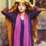
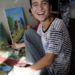
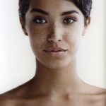
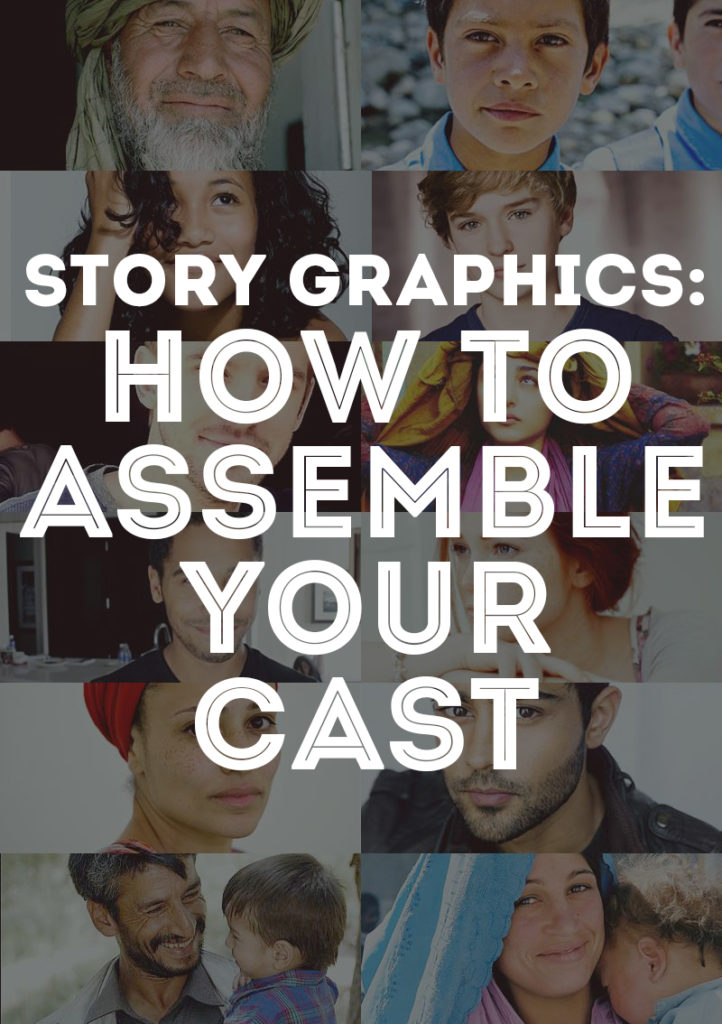
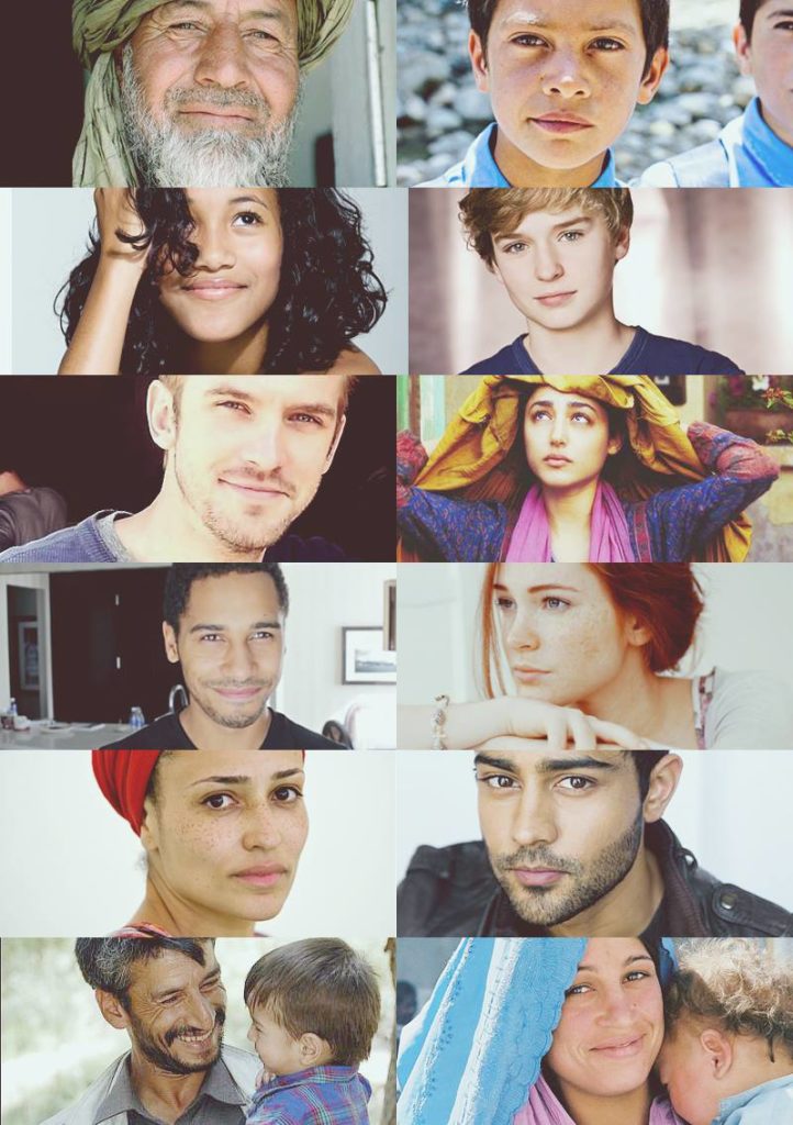
Above, you can see the cast for Eleventh Trade. Because the cast is huge but largely cameos (there are a lot of characters that flint in and out), I made myself cast the main characters and the minor characters. Even the ones who never show up in the present action of the story, but are vital to Sami’s growth.
Step 2: Arrange Your People
In your photo editor, start setting up your picture. You can do this by simply cropping the images and dropping them straight on, but I like to use a clipping mask in Photoshop. I’ll explain how to do that below.
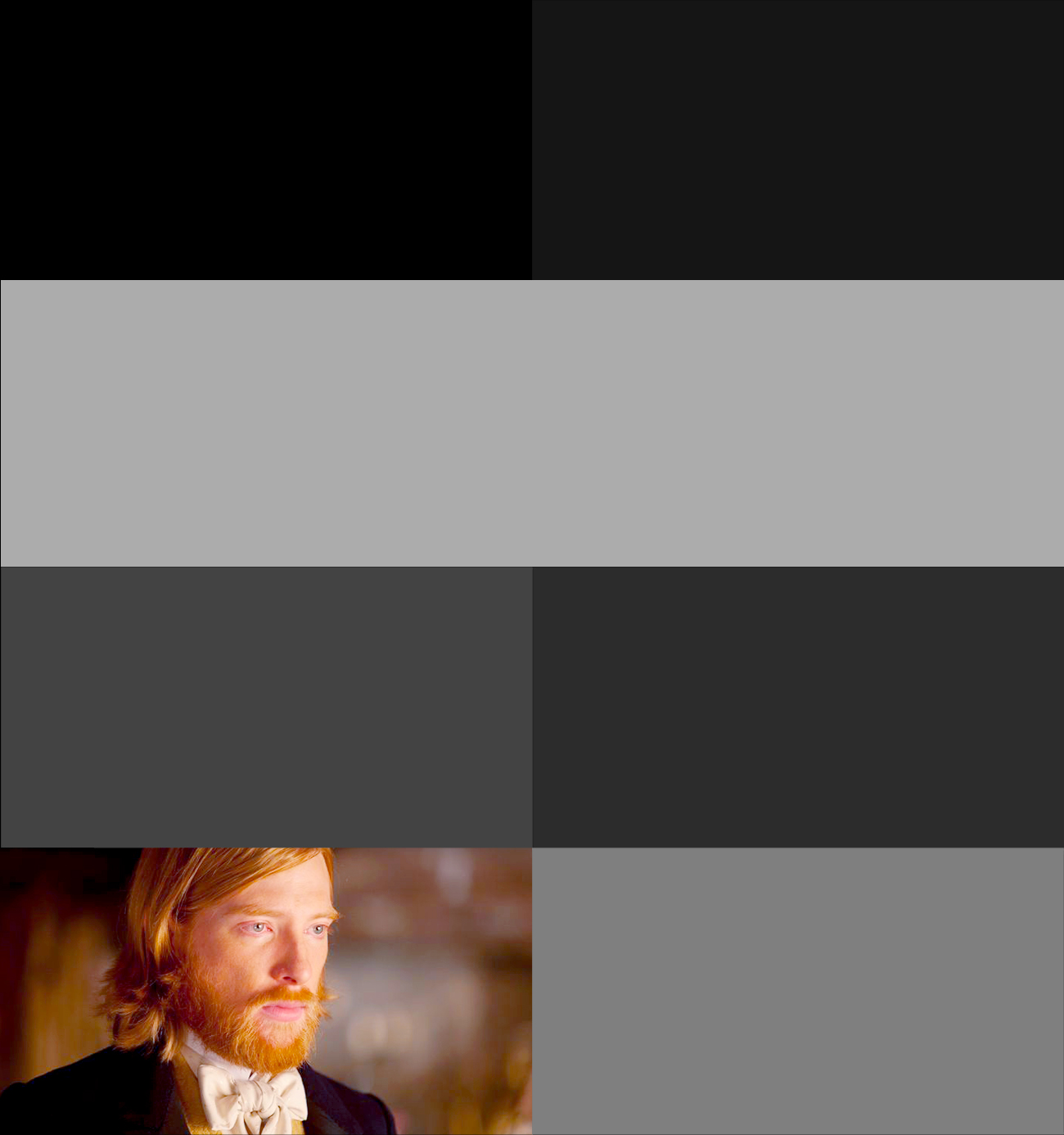
First, I make a base of different colored boxes. The different colors help me keep track of which one’s where.
Then I drop the pictures on top of them. I right-click the layer and choose “use clipping mask.” This means that the image I’ve just dropped will be confined to the space of the layer below it — aka, my pictures of people will show up in the shape of the rectangles below them, saving me a lot of cropping and adjusting problems.
This looks like:
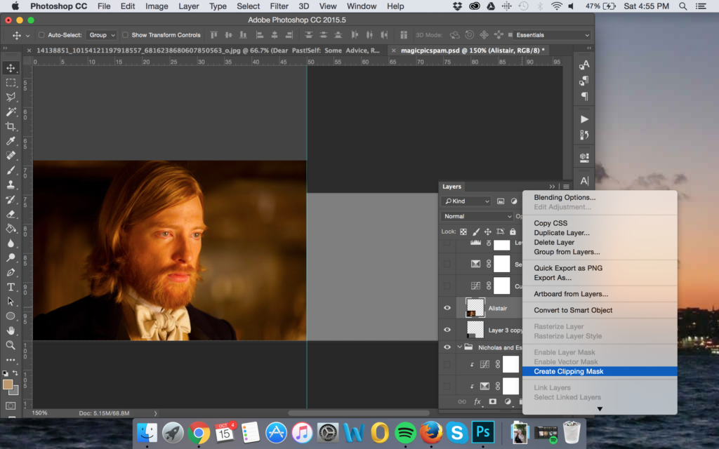
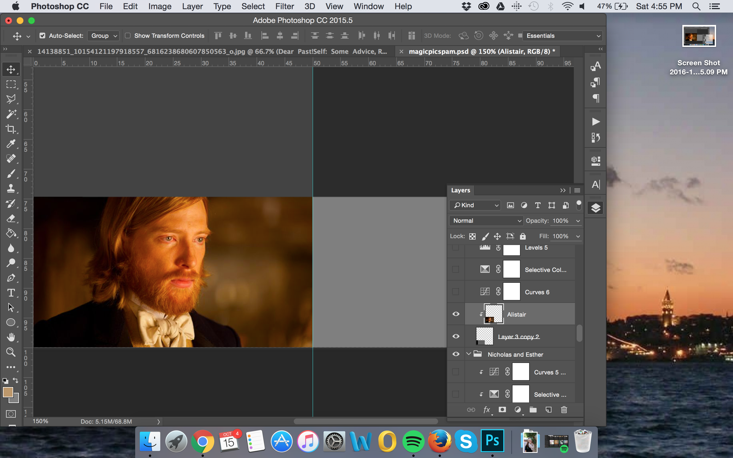
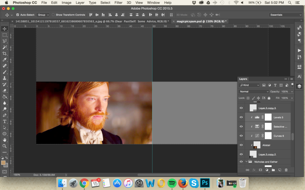
Go through and add your cast. Design tip: If they are facing at an angle, make them face toward the middle of the picture (instead of the edge) — unless you want to create a sense of tension. I’ll show an example below.
Step 3 (Optional): Touch-Up
If you want to be a bit of a design snob, this is where you add things like sharpening masks and curves and color correction. All of these layers can be made with clipping masks so they will only apply to the layer you want. You can also add in overlay layers and textures, etc etc, to unify the image as a whole.
Enjoy, fellow perfectionists.
Step 4: Admire Your Creation
Bam! You have your cast all together. Now when you need to brainstorm a certain character’s looks or expression, you have the inspiration right there.
The version above is for Eleventh Trade, and the version below is for my WIP American Heiresses (real name still forthcoming) that I write with a friend.
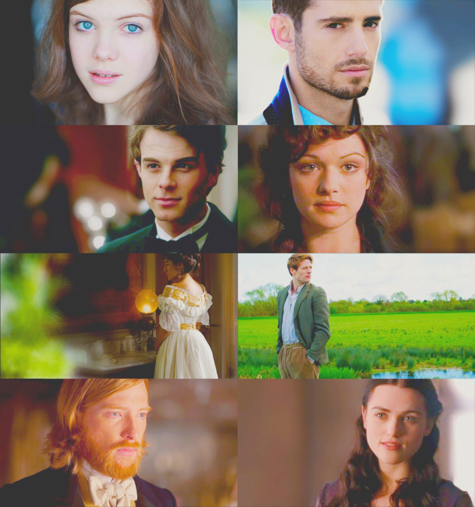
In this one, I intentionally placed some of the characters facing off screen to help create the mood. I also made sure I found everyone in semi-passible poses/costumes so that they look like they’ve come from the same era. (… Sorta. With some imagination.)
Have you ever put your cast together in a picture like this? I’d love to seem ’em! Share below!

