I’m so THRILLED to introduce you guys to my debut’s UK cover. Richard Merritt, Cherie Chapman, and the team over at Piccadilly Press have done a fab job putting this together, and I cannot wait to hold a copy in my hands.
I always like it when authors post the cover process, so that’s what we’re gonna do! Also, I’m a bit unusual in that I’ve been working with both my UK and US publishers simultaneously on this project. So while the UK was building these concepts, the US was already several months into a completely different look, which may or may not have been influenced significantly after Piccadilly finished this design. But you’ll get a different post for that reveal.
First, here’s The Eleventh Trade UK blurb:
REFUGEE BOY for a new generation – a debut novel for 9+ about a young refugee from Afghanistan and his search to find his grandfather’s precious musical instrument.
‘The world inside me expands. Even though my eyes are closed, I see my home.’
Back in Afghanistan, Sami’s grandfather was a famous musician. Even now in Boston the sound of his instrument, the rebab, is the sound of home.
Then the rebab is stolen and appears in a shop for $700. Sami has no money and nothing to sell. What he does have is something to trade.
But there are two sides to every bargain and Sami’s chance of success depends on the very last thing he wants — help.
Okay, so, we have the concept sketches:
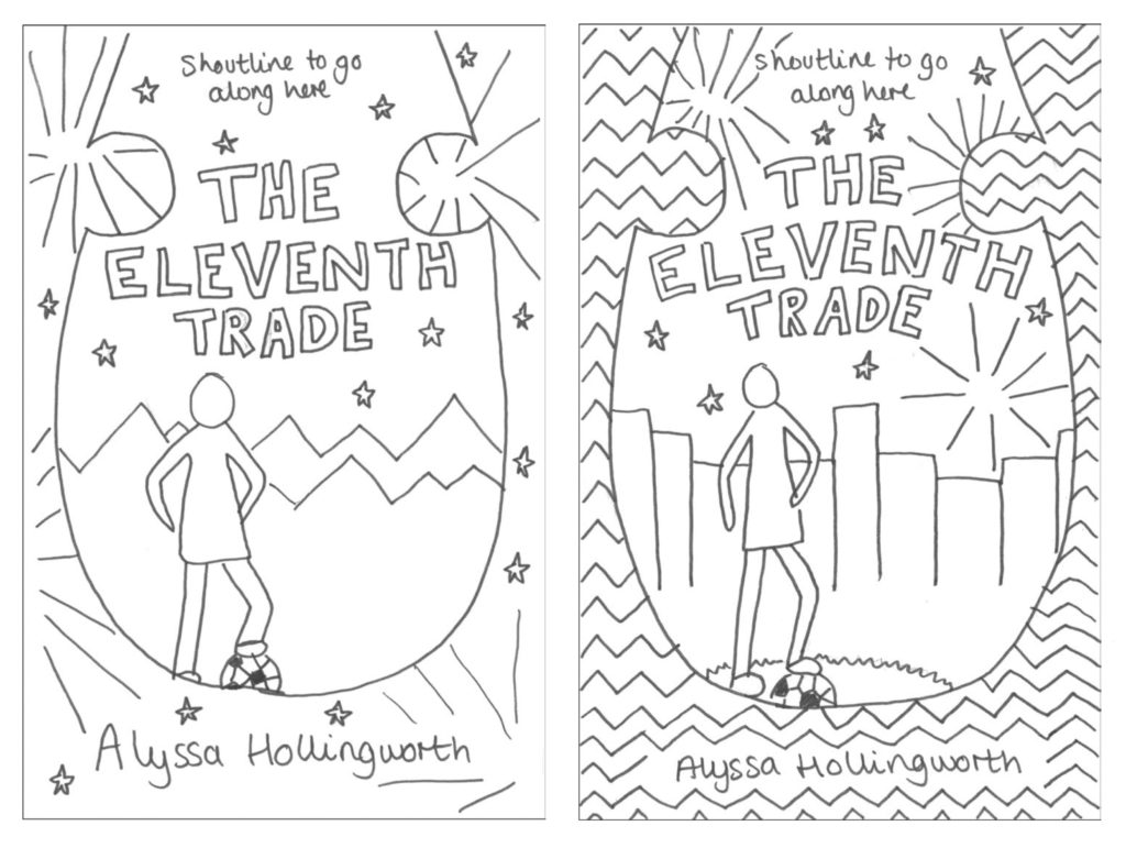
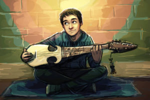
Cherie and the team over at Piccadilly came up with these ideas. For both of these concepts, we have my main character Sami framed by the shape of a rebab’s base. He’s got a soccer ball/football and is faced looking into the distance. On the left, we were thinking about having Sami in front of Afghanistan mountains. On the right, we’ve got him in front of the Boston skyline.
The initial gut reaction was that the Boston skyline would work better, but we went ahead and gave them the thumbs up pass the design to the cover artist.
Next, we have the roughs:
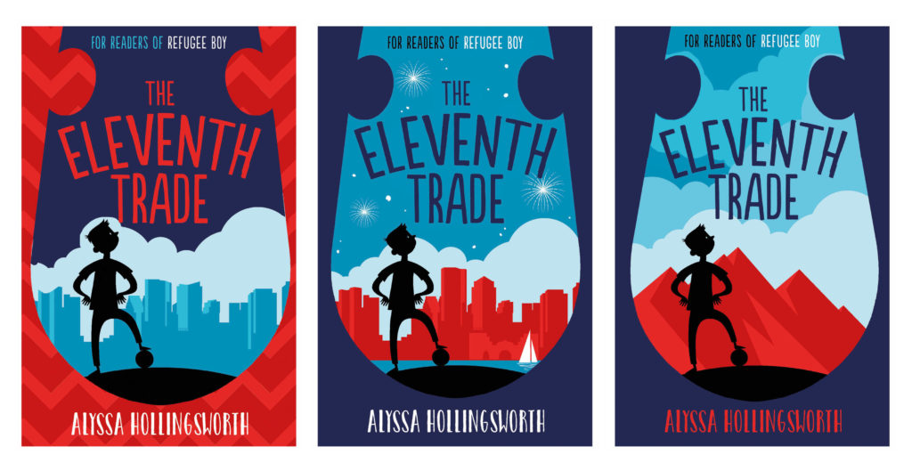
Richard received the concept sketches and came back with about five rough ideas for us to look over (all of them based around these three concepts). Our instinct about the mountains was right — it was just too different from the real story. So we set our attention on Boston.
I loved the skyline of Boston in concept #2, with the sailboat and everything. I meekly asked if we could add my favorite part of the skyline: Boston Customs House. I also asked if we could get Sami’s nose a bit less European (pointy) and maybe a bit more crooked. My editor, Fliss, did a great job of sifting through my many rambly emails and passing on the relevant feedback to Richard.
And with no further ado, the final design:
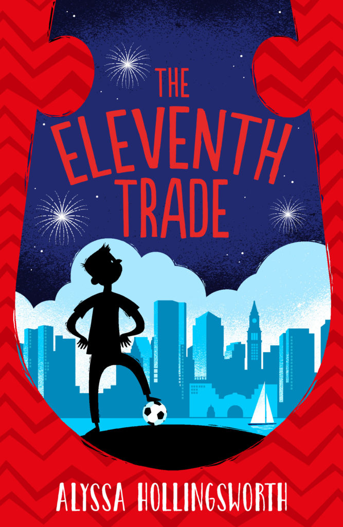
I’m so thrilled about this cover, ya’ll don’t even know.
What do you think? Leave a comment!
Preorder to Get the UK Copy on September 18:

