As I mentioned in my last post, I recently did a huge website overhaul to make sure my blog was appropriate for a fancy author sort of person. Also, since a lot of you seem to like my blog post about author business card designs, it seems that sharing a few tips from my research here might be helpful.
There are three main elements to any web design — hosting, the design itself (the way it looks), and the content (what’s on it + the way it’s organized). I’m going to address them all below, and give you some ideas for what you should and could put on your website — and what you might want to leave off.
I’ll be talking about ways you can create a cool website without breaking the bank, but I’m also a firm believer in paying for what you can’t do. Could you teach yourself CSS and create a website from scratch? Sure. Have I tried to do that before? Definitely. Will it look a thousand times better if you invest $60 in a professional template? YES. Especially because you’ll be saving yourself time, and your time is the most valuable think you own.
So, while I’ll be talking about the ways you can save, I also do recommend budgeting at least $200 for the whole package (domain + initial hosting costs + pretty aesthetic). You’ll need more if you want to go full out design crazy, but might be able to scrape by on less if you don’t care so much about professional elements (like having your own URL).
Here we goooo!
Boring Stuff: Hosting
Just a quick note on hosting, because it is necessary but also borrrrrinnggggg.
When you want to have a website, you need to buy the domain and the hosting for it.
Domain = the www.[your name here].com address
Hosting = the thing that turns that address into a website, aka your own corner of the interwebs
I use Bluehost for this website. Their set-up is easy for newbies, their prices are fairly reasonable, and their customer service is adequate for the level of assistance a normal blogger needs. You can buy a domain and web hosting package from them, so all your bases are covered.
GoDaddy is one that likes to get you, but I’m not even going to link them here. Their prices are cheap, but you will mysteriously start getting spam calls every day for years after you buy something from them. Don’t.
Wodu Media is the hosting company we use for WriteOnCon. WriteOnCon is an online kidlit conference that takes place in February, and we get so many visits that last year (while we were hosted by Bluehost) everything crashed the minute the events started. I won’t tell you the full horror story of that day, but let’s just say I did not move from my desk from 8AM until 3PM even though I had to go to the bathroom when I sat down at my desk that morning.
Ahem.
Wodu Media’s customer support is absolutely fabulous — thorough and quick. I’d recommend them if you expect to have sudden bursts of traffic on your website or if you want to be in very secure hands. You’ll pay a higher price for this service, but it can be worth it.
Design: The Way it Looks
Enough of the boring stuff — TIME FOR PRETTIES!
The way your website looks should reflect your “brand,” which for authors is just a fancy way of saying your genre and the age range you write for. Example: a lot of middle grade authors have bright and colorful websites, but many young adult authors opt for more artistic and atmospheric ones.
Let’s see what the pros are doing around the web.
Obvious disclaimer: Design is very subjective to taste so you are free to love designs I do not care so fondly for. Also, don’t judge an author by their website — normally that has very little reflection on their craft. Except when it does. I’ll leave that for you to decide.
Everything Important on One Page: The Frank Cole
Design:
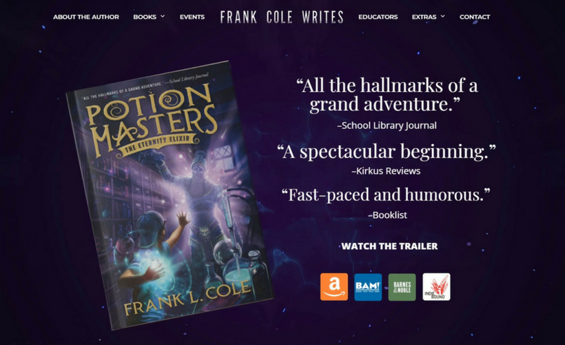
The dark color is immediately eye-catching (and matches the tone of Frank’s books), and the prominent placement of Frank’s latest book lets us know whose website we’re on. As you scroll down the home page, the colors alternate between purple/black and white/gray, which breaks up the content nicely so that it isn’t too overwhelming.
Content:
Many modern websites try to reduce the need to click around as much as possible. Frank Cole’s author site is a great example of this. When you arrive at the home page, you immediately have all the important information: Book stuff and buy links.
A menu at the top of the page gives you a few straightforward options, which should allow you to find the content you want quickly.
As you scroll down the main page, you’ll find out more about the book, then links to his other books, then quotes from reviews, and finally a contact form (that recommends booking a visit). The fun stuff on the page (like a book trailer) is great for any kid readers who might come across it, while the easy-to-find professional information makes this set-up very friendly for adults who might want specifics about Frank.
The home page is clearly the highlight of this design (the other pages might be just a touuuuuch on the plain side), but overall this is a good, functional, and engaging layout.
Accents and Landing Pages: The Icey Designs
Design:
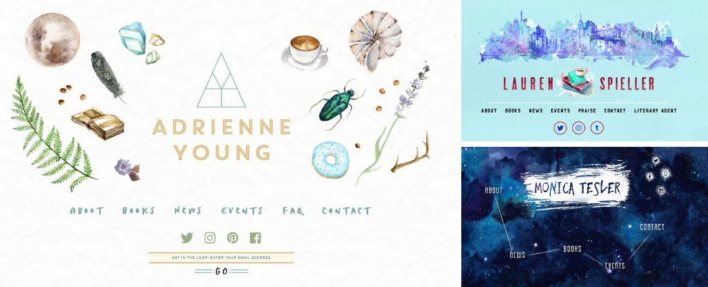
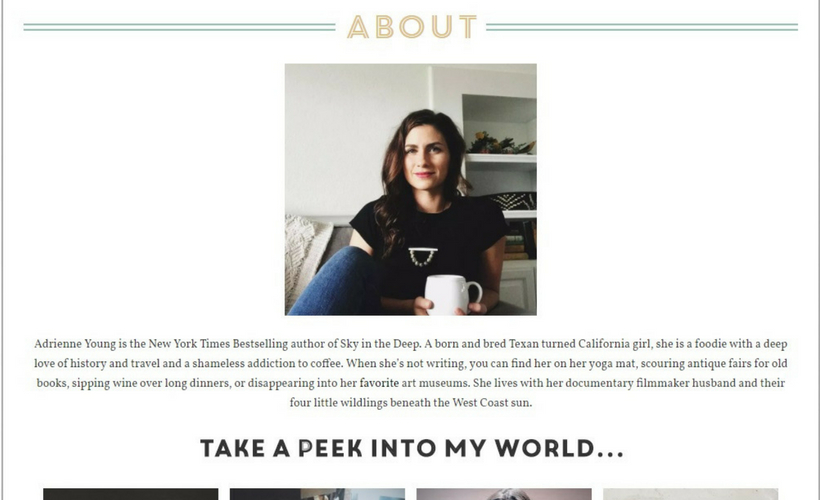
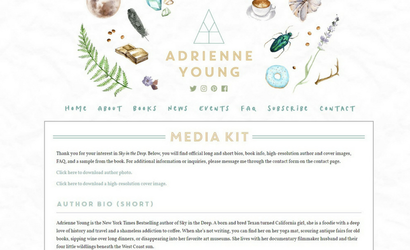
Adrienne Young, Lauren Spieller, and Monica Tesler are just a few of the authors who used the incredibly talented Icey Designs to create their websites. Icey Designs does most of the hard lifting for authors, providing brand consultations and coding for a fairly unique webpages. Those services come with a price, but they sure are pretty.
Though each website is personalized to the author, Icey Designs does have a few trademark elements you can quickly pin-point:
- They use a landing page that showcases aesthetic and personal branding (more about landing pages on the section below)
- Often they put an emphasis on helping the client get subscribers to their newsletter or social media
- Lots of little details and unique artwork make these designs really pop
Content:
These layouts all have very clear, relatively concise menus. That’s probably my favorite thing about them. If you came to these websites looking for specific information, it would be pretty apparent where you need to click next.
A definite drawback to these landing pages is the possibility that visitors will look at the pretty art and then go browsing somewhere else. The internet is full of Much Debate on the topic of landing pages, so it’s really up to your personal style whether you have one or not. You can get a quick overview of the issue here, see some good and bad examples here, and read a thorough guide here.
For the record, I think an Icey Design landing page is a lot better than, say, Kiera Cass’s landing page (which requires you to click “enter” before you even get a menu). So, if you’re going to do one, take the cue from Icey Designs.
Get Right to the Point: The Dana Middleton
Design:
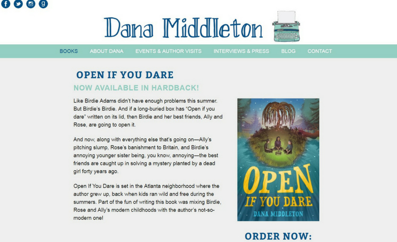
Dana Middleton uses a very minimal design to good effect. There are touches of personality (like her logo at the top of the page and the hand drawn elements throughout the website) that keep it from being too stale. The mixture of doodles along with the conservative color scheme and layout gives an overall calm and cool vibe.
Content:
Dana Middleton’s homepage is a sort of landing page… but with a different goal than the landing pages shown above. On her page, you immediately land on information about her most recent book, complete with a blurb and buy links. This is a bit like Frank Cole, but Dana’s provides some more information specific to the book before you even have to scroll. I like that this functions as a static page (it’s an attractive page to open when you first arrive at the website) but it also serves a specific purpose (hopefully, getting visitors to buy her book).
Other Author Websites I Like
For the sake of not writing an entire novel-length blog, here are other websites I’d recommend you check out for inspiration:
- Minimal and Majestic: The Hayley Chewins
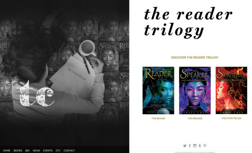
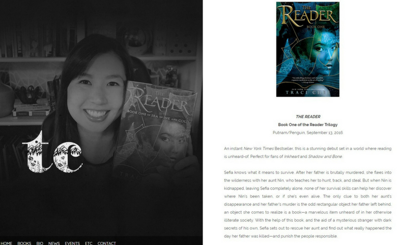
- Author Personality and Cool Logos: The Traci Chee
- Fun and Thorough: The Melanie Conklin
- Clean and Sweet: The Kate Bowler
- Focus on Book Art: The Katherine Marsh
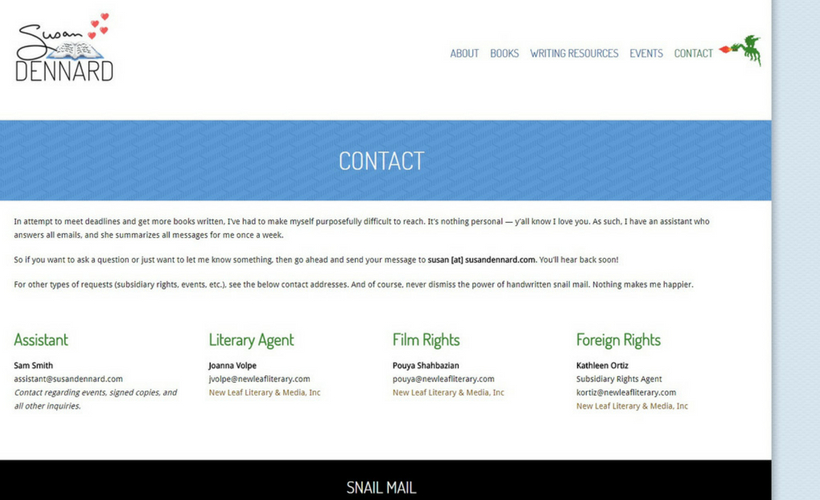
- Professionally Nerdy: The Susan Dennard
A few basic takeaways on design:
- Make sure you use a responsive layout (more like Sarah J Maas, less like Bella Forrest)
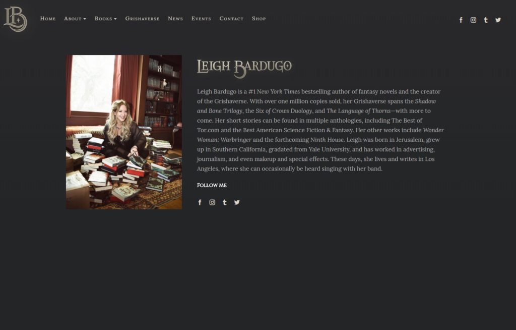
- Organize your page without too much clutter (more like Leigh Bardugo, less like Holly Goldberg Sloan)
- Avoid colors that clash (more like Maggie Stiefvater (neutrals with strong accents), less like Yale School of Art)
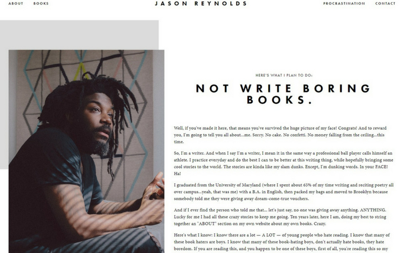
- Use high quality images (more like Jason Reynolds, less like Suzanne Collins)
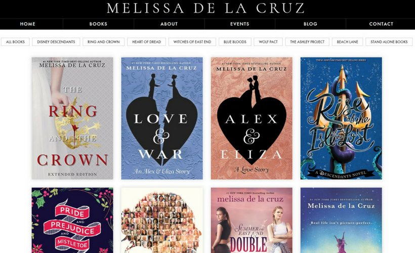
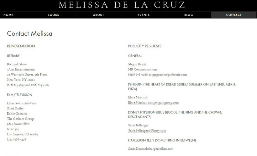
- Stay away from busy background images (more like Melissa de la Cruz, less like Cassandra Clare)
Specific Content Pages
Depending on your style as an author or the stage of your career, the individual pages you include on your website might be subject to personal taste and usefulness. But below I’ve listed the core pages you should keep around, and the optional extra pages you might find nice to feature.
Remember, the goal of any website is to keep visitors there — which means not forcing visitors to click around to find information. Try to keep your menu links as condensed as possible.
Bio Page
This page should contain a short bio. You can write this bio in first personal to make it more personal. It shouldn’t be longer than 300 or 350 words. Beside the bio, you should include a small picture of your author headshot (the one you use most often).
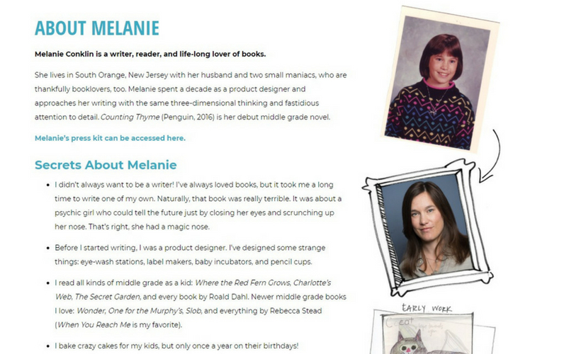
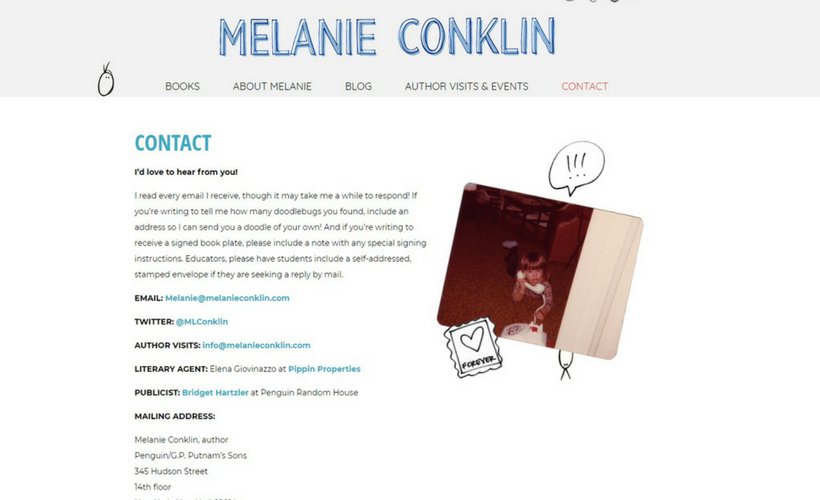
You can personalize this page with fun extras — like Adrienne Young (who shows a stream from her Instagram page) or Melanie Conklin (who has a list of “secrets” her readers would love). But that’s totally up to you.
Some Examples:
(click on the image to go to that page)
Press Page/Media Kit
This page is similar to the bio, but it is meant to be more formal. Your target audience here is conference organizers, newspaper reporters, interviewers… etc etc all the publicity people.
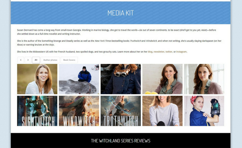
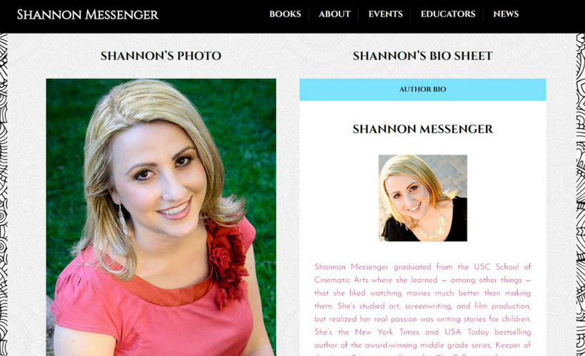
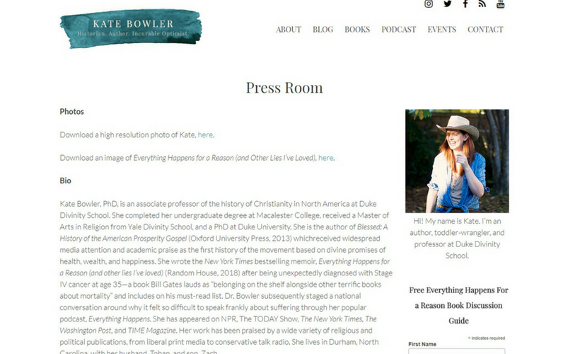
This page should include a short bio in third person. It can also include a longer bio (also in third person). You should have a high resolution headshot available for downloading, as well as high res pictures of your book cover(s). High res = big, basically.
There are a whole host of other things you might want to put on this page, like:
- Book details (pub date, length, ISBN, etc etc)
- Fun pictures of you (especially during drafting or doing research)
- Author visit guide
- Author visit tip sheet
- Contact info for yourself and your agent, publicist, and/or publisher
- Educator guides for your book(s)
- Links to book reviews and/or press quotes
- Any relevant branding material (logos, promotional images, etc)
- FAQs
- Interview links or links to articles by/about you around the web
Normally this page is nested beneath your bio page or your contact page. Some authors don’t include it at all. It’s really up to you. But speaking as a conference organizer, it is so freaking nice when all this information is tidy and accessible on one page.
Some Examples:
(click on the image to go to that page)
Book(s) Page
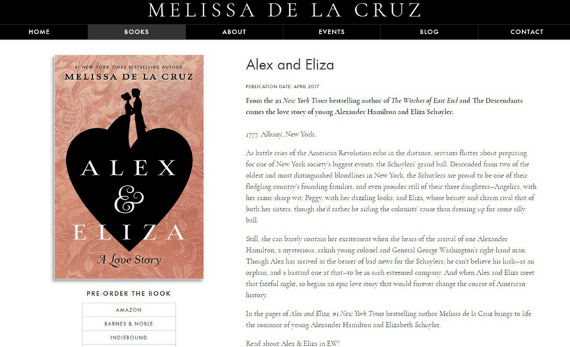
If you have more than one book (or series of books), you’ll normally display their covers as a gallery. When a visitor clicks the cover they want, they’ll be brought to an individual page for that particular book. Below I’ve shown the basic way this works on two particular sites, but all of the sites listed above will have fairly good options if you want to look for more ideas.
Some Examples:
(click on the image to go to that page)
Contact Page
This should be pretty straightforward: On this page, you list your contact information.
Normally this is another good place to link to your press kit, FAQ, newsletter, and/or bio if applicable. And if you have ’em, you should include contact info for your publicist, literary agent, foreign rights contact, and anyone else who might be responsible for shouldering some of your communication with the public.
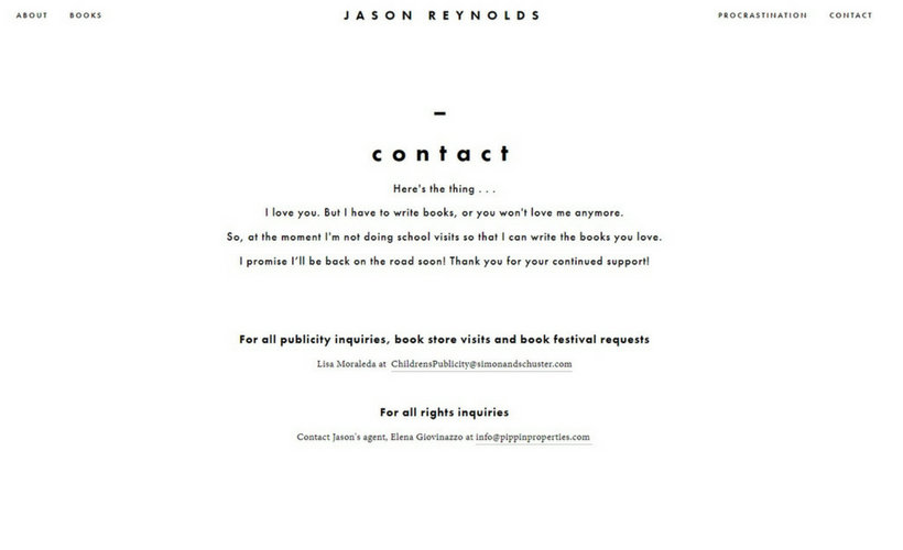
If you are incredibly popular, do put a note on this page about your response rate. I included a screencap of Jason Reynolds’s website because his disclaimer about being busy is funny and straightforward — the sort of thing a kid fan would understand, I would think.
It should go without saying, but do not put your personal information on this page. No home addresses or cell phone numbers. Nope.
Some Examples:
Optional Pages:
Most of the time, these optional pages will be nested underneath one of the main pages listed above. Some of them (like a blog) are purely for your own enjoyment — there’s no requirement that says every author has to have one. For examples of these and other pages (and examples of how they are organized in the overall website), go explore some of the websites listed above.
- Blog/Vlog
- Author Visits
- Events
- News
- Fanart
- Educators/School Resources
- FAQ
- Interviews/Press
My Website Deets
 If you’re still here, God bless you. I’m going to wrap this up with a few comments about how I put my website together, in case you’ll find it useful for your quest.
I began using the premium theme Highend back when we dusted off WriteOnCon in 2016. I immediately fell in love with its many many maaaaaaaaaaaaaany creative options and the no-nonsense organization of the theme itself. So when I wanted to change my blog over from Pick, Highend was the obvious choice.
I normally make my theme selection from Themeforest or Mojo Marketplace. Both of these have a ton of options and a huge following, which means lots of helpful reviews.
Be sure to do your research carefully and check up on the developers to make sure everything’s on the up and up. You want a layout that is responsive (that means it will be pretty on mobile or tablets), one that has thorough documentation (that will be your tool for setting it up and troubleshooting customization options), and one that has an active help forum (so you can search for answers to your questions, or ask your own if no one has yet).
With a professional theme like Highend, it’s pretty easy to go in yourself and customize to your heart’s content. That can save you several thousand dollars instead of hiring a professional web designer. The pro website would probably be cooler, let’s be honest — that’s why they are pros. But with a pro theme and some grit, you can make a nice website all on your own.
As I talked about in this blog entry, I hired the lovely Jonelle Jones for help with my personal brand and logo. This was a fairly big but extremely helpful investment. Once she had put together a style sheet for me, I went to town combining the ideas I liked from everything listed above and creating my own twist.
Viola! Author website.
So, was this guide helpful? Got questions? Leave a comment!

